The Challenge
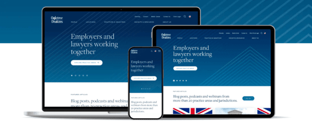
Ogletree Deakins is one of the largest labor and employment law firms with more than 900 attorneys located in 53 offices across the United States and in Europe, Canada, and Mexico. Our partner came to us with two goals: redesign, streamline and modernize their website, and develop detailed brand and digital guidelines.
Our Solution
With so many moving pieces, it was crucial that we work closely with our client stakeholders during the strategy phase to ensure the site would meet all their requirements from a technical standpoint as well as from the brand look and feel. Our responsive design concept had to work on a global scale culturally, account for character counts in various languages, and apply to all different areas of employment law, while incorporating an updated look and feel that still felt like the same brand. The result was a professional yet-modern looking website that put attorneys and their content front and center.

PHASE 1: Strategy & UX
During the Strategy phase, we interviewed dozens of stakeholders throughout the organization, fully understanding the unique pain points and expectations for each Ogletree department and location. Coming out of this phase, our deliverables were:
– Content Audit
– Content Strategy
– Technical Requirements
– Site Map
– Wireframes


PHASE 2: Creative Concept
During the Creative Concept phase, we incorporated learnings from our stakeholder interviews as we explored multiple look and feel directions and began development on a style guide for the new website. Deliverables coming out of this phase:
– Home page comps (2 design directions)
– Color palette options
– Typography exploration
– Photography direction
– Voice and tone

PHASE 3: Design & Development
This is the phase where the website really comes to life, as our partners can see our strategy and concepts in action, and stakeholders can make adjustments where needed.
The Design and Development teams worked together to build out the website based on the initial wires, working within the look and feel developed in the previous phase. We progressed in batches by website section, iterating and adjusting previous batches simultaneously as we went.

PHASE 4: Style Guide
As the Development Team continued work on the website, the Creative Team put together detailed brand guidelines, based on the look and feel established earlier.
We developed both a Brand Book and a Digital Style Guide, along with an online brand portal to house all guidelines, assets and templates created throughout the project. Deliverables included but were not limited to:
– Brand and digital style guide
– Voice and tone
– Photography, icon, and design asset library
– Typography guidelines
– Branded firm logos and logo templates
– Color palettes for overall brand and individual departments
– Templates including flyer, letterhead, email header and PPT


2 Comments
Henry Jones
This sounds good plus I really love the website. It works great for any type of creative corporate project!
Alisha Williams
the customer support team is awesome! Thank you for the fast resolution, my website runs smoothly